


Using Pandas to extract useful data and Matplotlib to create a chart.
This was one of the projects I needed to complete to earn my certificate in the Coursera course Applied Plotting, Charting & Data Representation in Python by the University of Michigan.
I won’t be sharing the exact code in order to abide by Coursera’s honor code, however, I will describe the problem:
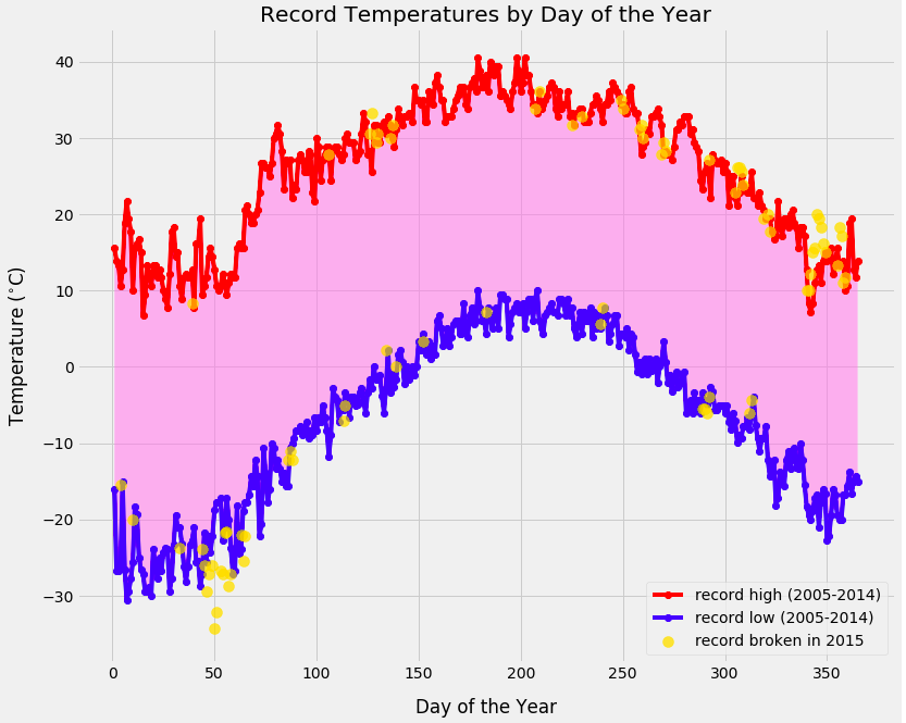
Given a CSV of weather data ranging from 2005 to 2015, I wanted to plot the record high and low temperatures (in degrees celsius) of each day of the year over the period from 2005 to 2014 and then plot the points of 2015, where records were broken.
I approached the problem by first splitting off data from the year 2015 into a different Pandas DataFrame. Then I reformatted the date values to exclude year and used groupby() to find the minimum and maximum values for each day. Next, I looped through each day and compared the 2015 highs and lows to the records from 2005-2014 and appending the day and value to arrays if the 2015 values broke the records.
Finally, I plotted each of the records from 2005-2014 and scattered the points from 2015 that broke records.